


When you think of Ferrari, what’s the first image that pops into your mind? For most people, it’s not just the sleek red sports cars—it’s the prancing horse logo. That small emblem sitting proudly on the hood of every Ferrari has become one of the most recognizable symbols in the world. But how did a simple horse design become such a powerful cultural icon?
In this article, we’ll dive deep into the history, symbolism, evolution, and impact of the Ferrari logo. Think of it like pulling back the curtain on a magician’s trick—you’ll discover the story behind the symbol that makes Ferrari more than just a car brand.
The Birth of a Legend
Every great story has a beginning, and Ferrari’s logo is no different. The tale starts in Italy, long before Ferrari became a household name in luxury cars.
Enzo Ferrari, the founder, didn’t create the horse symbol from scratch. Instead, he inherited it from a war hero. The prancing horse first appeared on the fuselage of Italian fighter planes flown by Count Francesco Baracca, a famous World War I pilot. After Baracca’s death, his family suggested that Enzo adopt the horse as a symbol of good luck for his racing cars.
And so, in 1929, the prancing horse found a new life—not in the skies, but on the racetrack.
The Meaning Behind the Prancing Horse
Why a horse? Why not a lion, eagle, or another fierce animal? Horses symbolize strength, speed, freedom, and elegance—all qualities that perfectly align with Ferrari’s identity.
-
Strength: Horses have always been linked with power, and Ferrari’s cars deliver nothing short of raw mechanical force.
-
Speed: Just as a horse gallops, Ferrari cars are built to race and dominate.
-
Freedom: The horse represents movement and independence, a metaphor for the open road.
-
Elegance: A horse’s stance is graceful, much like the sculpted curves of a Ferrari.
It’s almost poetic that this single animal manages to embody everything Ferrari stands for.
The Shield Shape and Colors
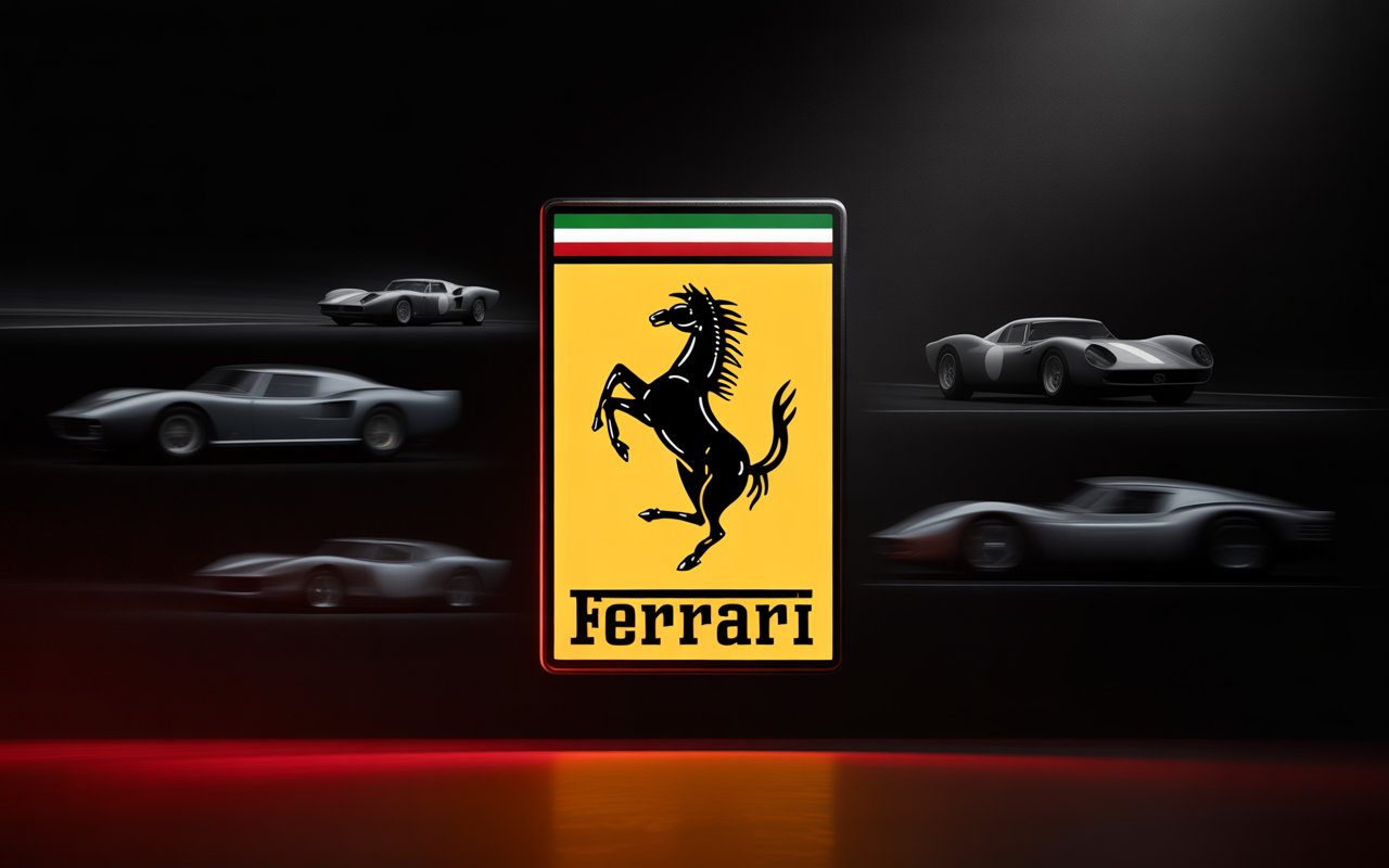
The Ferrari logo isn’t just the horse. Look closer, and you’ll notice details that carry meaning:
-
The Yellow Background: This represents the city of Modena, Enzo Ferrari’s birthplace. The shade is more than decorative—it roots the brand in its Italian heritage.
-
The Italian Tricolor: At the top of the shield, you’ll see stripes of green, white, and red. This small detail proudly ties Ferrari to Italy.
-
The Letters “S F”: These stand for Scuderia Ferrari, meaning Ferrari’s racing stable. It reminds us that before Ferrari was a luxury carmaker, it was a racing team.
Every piece of the design is intentional, almost like ingredients in a recipe. Take one away, and the logo wouldn’t feel complete.
From Racetrack to Road Cars
In its early years, Ferrari’s logo appeared mostly in the world of motorsports. The emblem decorated racing cars, uniforms, and flags, becoming a badge of honor for those who competed under its name.
As Ferrari shifted into road cars after World War II, the prancing horse moved with it. Suddenly, everyday people (well, the wealthy ones) could own a car that carried the same emblem as the racing greats. This transition transformed the logo from a motorsport symbol into a global status symbol.
Ferrari vs. Other Car Logos
Here’s an interesting exercise—line up a Ferrari next to a Lamborghini, Porsche, or Maserati. Each brand uses animals or symbols tied to heritage, but Ferrari’s stands apart.
-
Lamborghini uses a raging bull, emphasizing aggression.
-
Porsche combines a horse with antlers and colors tied to Stuttgart.
-
Maserati features a trident, a nod to Neptune and maritime strength.
Ferrari’s horse is less about intimidation and more about refined power. It’s strong without being brutal, elegant without being fragile. That balance has helped it endure as a timeless design.
The Logo’s Evolution Through Time
Even though the Ferrari logo looks timeless, it has undergone subtle changes over the years. Designers have polished the horse’s lines, adjusted the shield’s proportions, and refined the typography.
What’s fascinating is that Ferrari never strayed too far from the original concept. Unlike many companies that completely redesign their logos to stay modern, Ferrari has chosen evolution over revolution. This consistency keeps the brand’s identity intact.
More Than a Car Logo: A Cultural Icon
At this point, the Ferrari logo is no longer just about cars—it’s about culture. It’s appeared on clothing, watches, shoes, and even children’s toys. You don’t need to be a car enthusiast to recognize it.
Think of the logo like a crown jewel. Owning a Ferrari is out of reach for most people, but wearing a Ferrari-branded cap or jacket offers a small slice of the dream. The prancing horse carries aspirational value, almost like luxury fashion labels.
Ferrari Logo in Motorsport
Racing is Ferrari’s DNA, and the logo is everywhere in Formula One. From pit crews’ uniforms to the nose cones of cars, the horse isn’t just decoration—it’s intimidation. Other teams know they’re up against decades of history when they see it.
Fans, too, wave flags with the emblem, creating a sea of yellow and black at racetracks. For them, the logo isn’t corporate branding—it’s a badge of loyalty.
Brand Identity and Emotional Connection
Why do people feel so strongly about a logo? The answer lies in emotional branding. Ferrari has carefully cultivated its image around passion, speed, and exclusivity.
When you see the prancing horse, you don’t just think “car.” You think luxury, Italy, motorsport, prestige, and desire. It’s an emotional trigger, the same way seeing the Apple logo might make you think of innovation.
Fun Facts About the Ferrari Logo
To keep things light, here are some fun tidbits:
-
The horse always prances to the left, never the right.
-
The color yellow was chosen not just for Modena but also because it stands out on racetracks.
-
Ferrari once sued other companies that tried to copy the horse, protecting its exclusivity.
-
The horse’s design is slightly different depending on whether it’s on a car badge or official merchandise.
It’s the small details that keep the logo unique.
Why the Logo Still Matters Today
In an age where logos are everywhere—from apps to sneakers—you might wonder why Ferrari’s still carries weight. The answer is simple: it represents not just a company, but a legacy.
The prancing horse is proof that a logo can be timeless if it’s tied to a deeper story. Ferrari has stayed true to its roots, and the emblem remains one of the strongest in the world.
Conclusion: More Than Just a Horse
The Ferrari logo isn’t just a piece of graphic design—it’s a story, a legacy, and a dream. From a pilot’s airplane in World War I to the fastest cars on Earth, the prancing horse has traveled through history with grace and power.
Next time you see it, remember: it’s not just a horse. It’s a symbol of passion, speed, and the pursuit of excellence.
FAQs
1. What does the Ferrari logo symbolize?
The prancing horse symbolizes strength, speed, elegance, and freedom—all qualities that Ferrari embodies in its cars.
2. Who originally used the prancing horse symbol?
It was first used by Italian fighter pilot Francesco Baracca during World War I before Enzo Ferrari adopted it.
3. Why is the background of the Ferrari logo yellow?
The yellow background represents Modena, the birthplace of Enzo Ferrari.
4. Has the Ferrari logo ever changed significantly?
While it has been refined over time, the Ferrari logo has never undergone a dramatic redesign, keeping its classic identity intact.
5. Why is the Ferrari logo so famous worldwide?
Because it’s tied to both luxury cars and motorsport, the logo represents prestige, performance, and cultural influence beyond just automobiles.